

Agents’ Last Exam
or, Benchmarks Are Hard

Originally presented as a live talk on June 24, 2026

Background
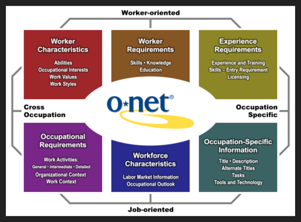
Let’s start today’s discussion with a bit of economic background, since one of ALE’s goals is to measure progress on “economically valuable” tasks.
The US Bureau of Labor Statistics maintains something called Standard Occupational Classification, or “SOC”. SOC is a taxonomy of jobs, with 23 major groups at the top and over 800 detailed occupations at the bottom. Each job gets an ID, so like 15-1252 means “Software Developers” and 27-2023 means “Umpires, Referees, and Other Sports Officials”.
Now a level more detailed than that is the Occupational Information Network, or “O*NET”. O*NET extends each code with specific job titles, and it describes in detail what the job actually does and what it requires.
So continuing with my example of “Umpires, Referees, and Other Sports Officials,” the key duties include “officiating at sporting events” and “inspecting game sites for compliance with regulations or safety requirements”. Key abilities include communication and deductive reasoning. There’s a ton more detail on the job - knowledge required, areas of interest that align with the job, appropriate styles of work - but for our purposes the only other relevant bit is the software skills required. For umps, it’s not much more than email and browser, but for other jobs it’s going to be quite relevant for our agents-replacing-humans benchmark.
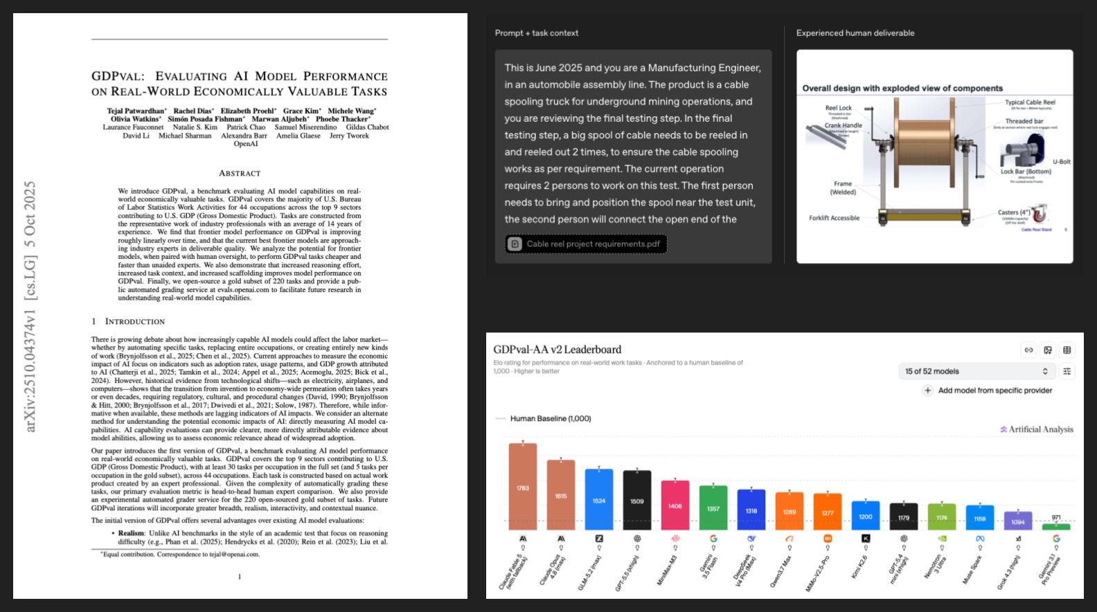
Speaking of, here’s one of the leading players in the space: GDPval, from OpenAI.
GDPval, which is a fantastic name by the way, draws directly from O*NET to design its distribution. Specifically, the authors picked the top 9 sectors by contribution to US GDP, then picked 44 occupations within them, then designed tasks to cover the majority of O*NET work activities for each of those 44 occupations. So using the authority of O*NET, the authors could reasonably claim to measure potential to impact GDP.
Of course, the major filter on their selection of sectors and occupations was how much work happens on computers, in a way that doesn’t require other people. So for example, not only are physical jobs like Firefighter or Chef out, but so are mostly interactive or management jobs like Sales Representative or CEO. Still, they end up pretty representative of predominantly digital work, across sectors like real estate, government, manufacturing, health care and more. You can see in the example task in the top-right that the job is Manufacturing Engineer, and the task is to design a cable spooling truck for underground mining operations.
Now for us at Scale in particular, where the tasks came from is of particular interest. OpenAI sourced contributors with an average of 14 years of experience from a variety of firms across each sector and conducted a video interview, ran a background check, and gave them training + a quiz. The accepted contributors then produced tasks using real work materials, with a prompt and the requisite artifacts as inputs and whatever deliverable as the output - stuff like a legal brief or a care plan or a financial model. Of course the tasks got plenty of quality control, both automated and manual.
The benchmark comprises 1,320 tasks across its 44 occupations, but only 220 are public; the rest are private, with updates on GPT and selected competitors whenever OpenAI releases new models. For example, in the GPT-5.5 release, they reported on GPT-5.5, GPT-5.4, Opus 4.7, and Gemini 3.1 Pro.
As for what they’re reporting, the main thing they care about is whether AI can replace humans in the job, so what they actually measure is expert preference on the AI output vs the original, human output. If the rater has no preference or thinks the AI version is better in a blind comparison, they count it. Most recently, GPT-5.5 scored 84.9%, although we don’t know the split between wins and ties.
Of course we’d like to know how lots of models score on GDPval, not just the ones OpenAI deems worthy of their time, so folks have adapted the 220 public tasks into different versions of the benchmark. The one I see most often is called GDPval-AA, from Artificial Analysis, hence the “AA” in the name. You’ll see on the chart that they have a much wider array of models, including some from after GPT-5.5 came out. The most noteworthy one on there is GLM-5.2, an open-weights model that apparently matches GPT-5.5.
You’ll also notice they do not report a win + tie rate! Instead, they report Elo, basically a power ranking across all the measured models. That’s because for GDPval-AA, they do head-to-head between models, not model vs human reference solution, so there is no common standard to compare against. Relatedly, their pipeline is automatic, using an LLM judge (with access to the human reference solution) to pick the winner of each matchup.
One virtue of their scoring system is it can’t really saturate. Like if GPT-5.5 is already equal to or better than humans on 85% of tasks, there’s not much more GPT-5.6 can do on that metric. But as we see on the chart, Fable 5 pretty well crushes GPT-5.5, in a way that may not be obvious when GPT-5.6 comes out and we see the updated scores for GDPval. Relatedly, GDPval-AA is what Anthropic reported on the Fable 5 release notes.
Finally, one advantage of GDPval-AA in my opinion is they have their own harness, and they use it across all the models. By contrast, OpenAI uses each model within its own harness, and the harness for GPT in particular gets some benchmark-specific tools. On the one hand, it does make sense to measure “this is the best performance we could get from each model”, but I think for a leaderboard it’s more intuitive to have as neutral of a harness as possible. Keep that in mind for when we get to the results of this week’s paper.
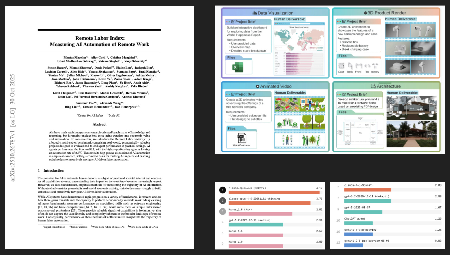
The other leading player in the agents-replacing-humans space is Remote Labor Index, which is a collaboration between Scale and a research organization called Center for AI Safety.
Like GDPval, RLI sources a bunch of economically representative work and has agents attempt to recreate it. However, many details vary.
One is the overall approach or framing. Specifically, while GDPval uses top-down design based on a government taxonomy, RLI takes a bottoms-up approach: look at platforms like Upwork as a reflection of what computer work actually gets outsourced today, and sample from it. They do compare to GDPval to ensure the distribution of tasks isn’t too divergent though, and they somewhat oversampled from the more obscure task types to ensure broad coverage.
Anyway, the authors sourced real projects from over 300 freelancers, representing over $140k and over 6k hours of real work. After quality filtering, they end up with 240 projects across 23 different Upwork categories, like architecture, marketing, and game development. You can see examples of projects in the top-right.
As for grading, they have two modes: model vs human reference project, and model vs model - the same ones that GDPval and GDPval-AA cover, respectively. However, it’s human graders in both cases, so it’s expensive to update the leaderboard, which is why it’s a bit stale as you’ll see in the bottom-right.
So for model vs human, they ask the grader one question: “Does the alternative satisfy the brief at least as well as the reference, such that it would be accepted by a reasonable client?” The grader gives a 1 for no, 2 for yes, and 3 for strong yes, like if the model clearly surpassed the brief. The figure of merit there is what they call the “Automation Rate”, which is the count of 2s and 3s divided by the total count. Automation Rate is what you see on the leaderboard, and it’s quite low - just over 4% for Opus 4.6 in the Cowork harness.
Speaking of harnesses, note the number three player on the leaderboard: Manus, the company Meta acquired but then recently had to un-acquire on orders from the Chinese government. Manus doesn’t even make any models - it only makes a harness. Again, we’ll see the importance of the harness as we dive into ALE.
The Paper
So just like GDPval and RLI, ALE is supposed to measure AI’s ability to replace humans on long-horizon, economically valuable work. ALE has a couple differentiators, which we’ll come back to, but broadly it is the same as the other two.
Since we know the premise already, let’s get into the details.
First, to actually build a benchmark, you need to know your target distributions. In the case of ALE, the most important distribution is domain coverage, like which jobs and duties to cover. They’re going to take the GDPval approach and start with O*NET, but instead of just looking at the top occupations by GDP contribution, they’re going to shoot for maximum coverage. Specifically, they filtered all of O*NET down to jobs that are primarily digital, then clustered them into 13 domains with 55 subdomains.
Once you have your distribution of domains, now you can go find the experts in the domains. Here they relied on their personal network and some referrals, which is reasonable but quite informal from the Scale perspective. Of course, this is an academic publication, and academic budgets can’t generally support the kind of large-scale, dedicated sourcing operation a well-funded company can run.
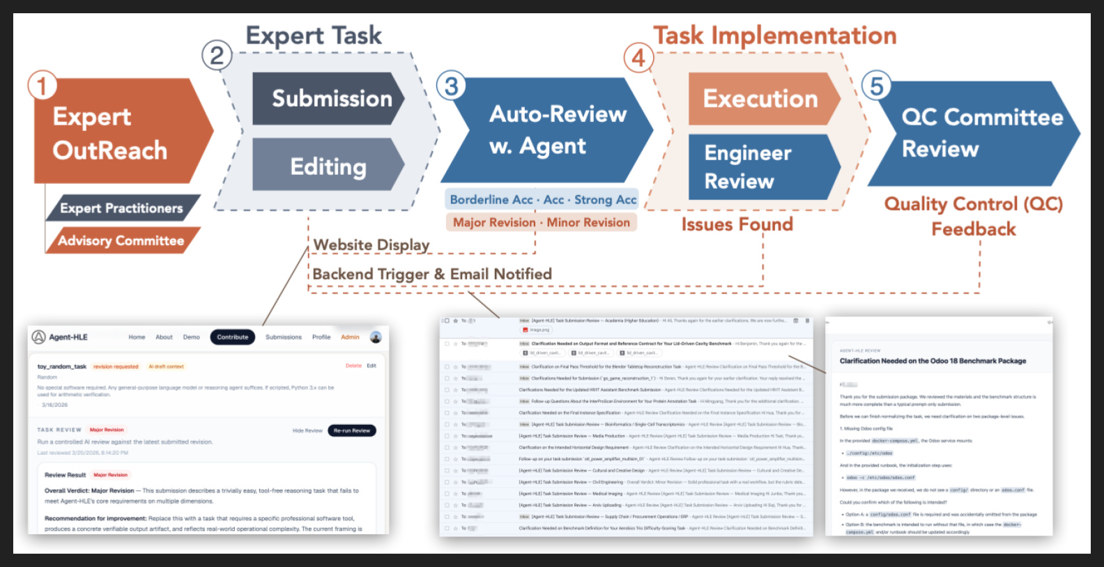
Now pulling from the Humanity’s Last Exam playbook, which Scale co-authored of course, they set up a portal for submissions to then vet. They do also explicitly commission some tasks, but mostly they are taking external “attempts” and reviewing them.
As for the reviewers, the first layer is an agent. Then a human engineer tries to convert the task into a standard format within an environment, which can expose quality issues but isn’t a quality step per se. Finally, there is a QC committee, which we don’t get much information about.
Again, from a Scale perspective the pipeline is rudimentary, but it’s understandable given the constraints. It’s hard and expensive to produce a good benchmark!
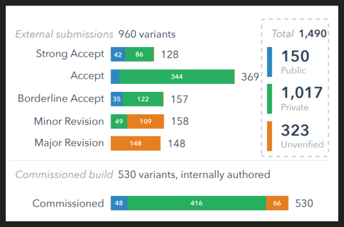
Here’s a look at their pipeline numbers at their time of publishing, which hopefully have improved, because they’re not even done with all their tasks! Out of a total of 1,490 submitted and commissioned, 323 are still not QC’ed. From a Scale perspective I think that’s shocking, but even from an outside perspective I think it’s a bit dishonest to include unverified tasks in your benchmark.
I also found their review process a bit odd. It’s inspired by the conference paper review process - that’s where the verdict names come from - but peer review doesn’t exactly have the best reputation for producing quality. So I’m a little skeptical here.
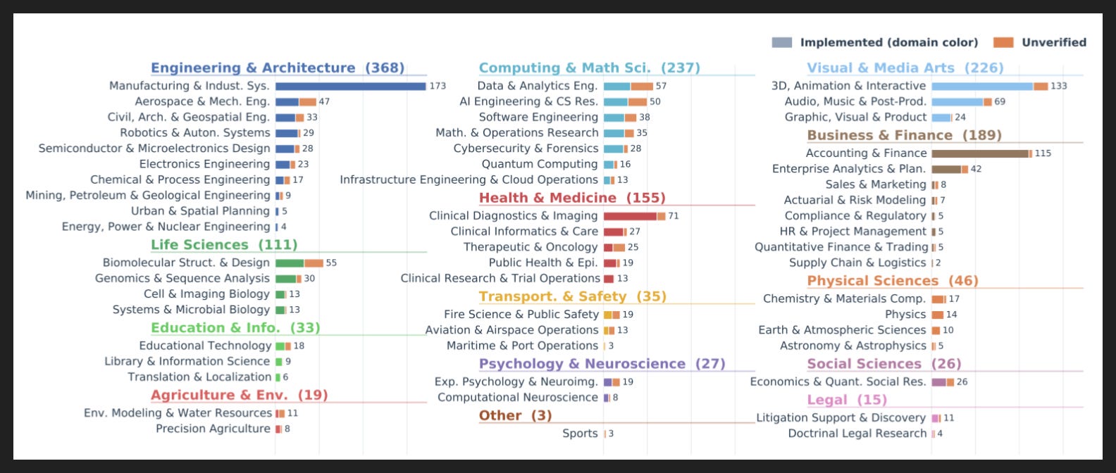
Breaking the aggregate numbers into domains and subdomains, we can see good absolute coverage but some lopsided distributions within covered domains. I think because they don’t have anything external to moor to, like economic rankings as in GDPval or the empirical distribution on Upwork as in RLI, there’s no strong opinion about exactly how the distribution should look. I think practically speaking it’s mostly a result of who they could find in their expert sourcing efforts, which would be a biased sample, but that’s my speculation - they don’t explain.
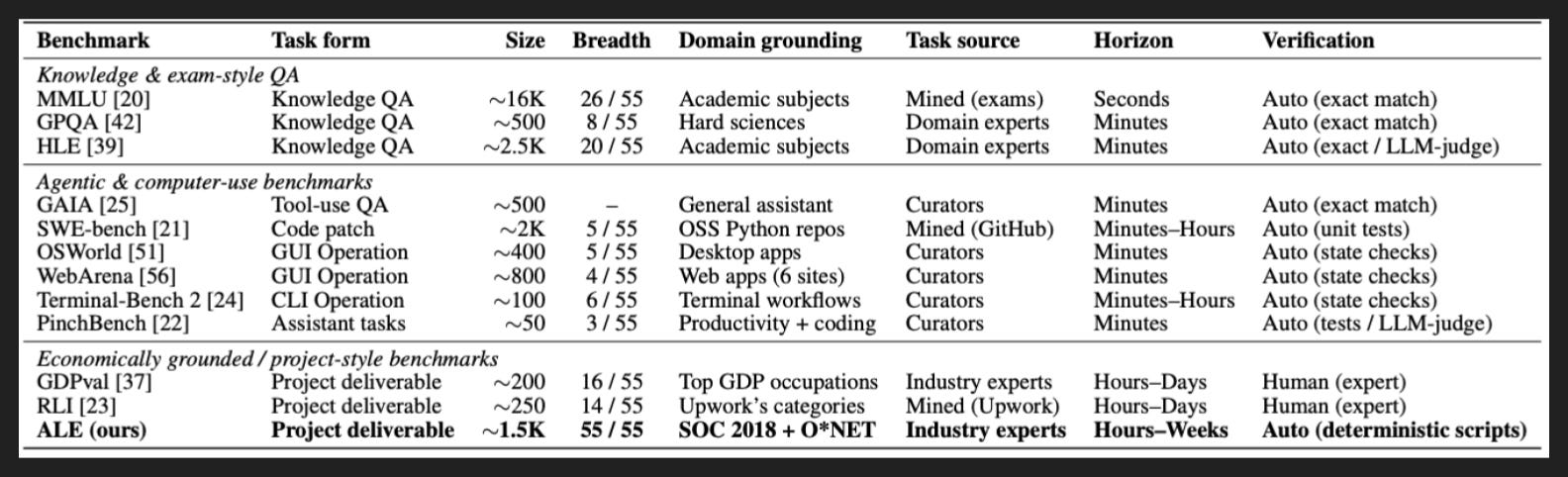
Here is where the tasks net out. They include some knowledge, coding, and computer use benchmarks for completeness I suppose, but the real competition is just GDPval and RLI.
The first figure they call out is size, which seems to be clearly in their favor. However, as we saw before, only 150 are public, and over 300 aren’t even done yet! So I think it’s frankly inappropriate for them to put 1.5k here, especially because they only put the public slice in for GDPval; the full GDPval has over 1.3k tasks.
The second figure, breadth, is far more honest. They do genuinely cover a wider variety of domains, and it highlights the different purpose ALE serves: a test of capabilities, not a share of most economically valuable tasks. It’s right in the name - it’s the last exam.
Looking ahead, they claim a longer horizon on the top end. That is possible, but they don’t back it up with specific numbers anywhere - they’re just passing along the self-reporting from their contributors. More importantly though, the agents taking this last exam only get five hours per task. Of course agents can work faster than humans, especially if calling sub-agents to work in parallel, but it makes me think either that “weeks” is an exaggeration or that five hours is artificially low. Later on they do note that only 4.3% of tasks hit the 5 hour cap, but that could line up with the tail end of the horizon distribution. So I’m skeptical on the high end of their time horizons.
The last difference, verification, deserves its own slide.
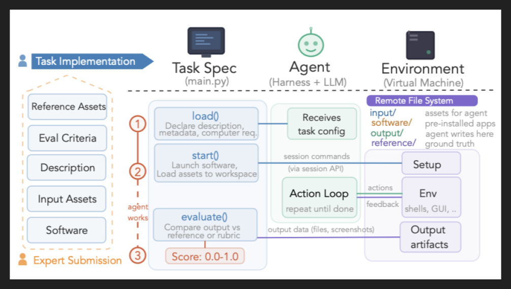
Concretely, here is what goes into a task and how it gets evaluated.
First, you’ve got all the stuff for your task: the description of the work to be done, the required inputs, the software tools available, how to evaluate the outputs, and reference assets - the golden output from the human expert.
That all ends up in an environment where the agent is gonna run. Once it’s there, you kick off the run, and the agent gets five hours to complete the work. There’s no further direction from a human, but the agent is getting plenty of feedback from the environment, like seeing the outputs of the software tools it’s using.
Once the agent is done, either by its own decision or by hitting the time limit, the outputs go to the automatic evaluator, which returns a score between zero and one.
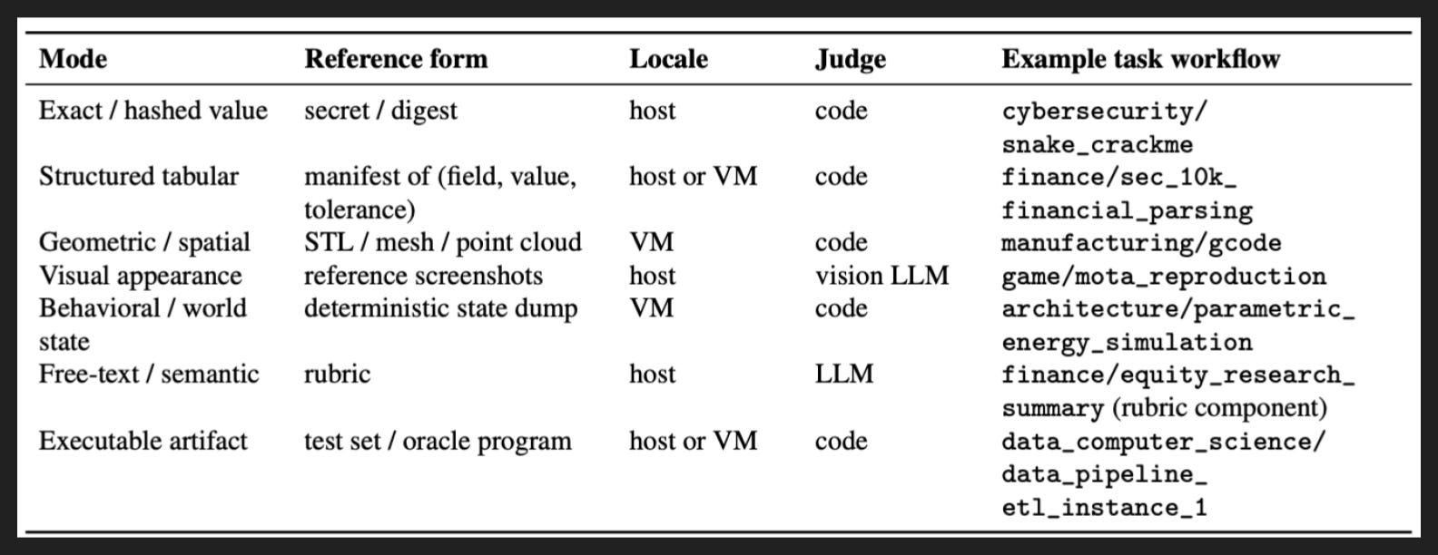
Now as for the automatic evaluator, the exact method depends on the output type. For handy reference, they’ve given every method in this table.
For 93% of tasks, the automatic method is a pretty natural fit, like running code against a test set or checking a 3D object’s dimensions. However, for 7% of tasks, they have to use an LLM judge, mostly for visual comparisons but occasionally for free text. The judges do get rubrics, but already there’s a bit of judgment creeping into their automated methods.
More broadly though, there are two issues in my view. One is that some aspects of quality are not easy to automatically evaluate, even if other aspects for the same task are. So for example, while it’s easy to check code for correctness with tests, it’s hard to check maintainability.
The second, which is broader, is that many tasks are practically impossible to automatically evaluate, so restricting your benchmark to tasks with automatically evaluable quality gives you a biased view. I don’t think that’s a problem per se, but I do think automatic verifiability is at odds with their other two goals of realism and breadth.
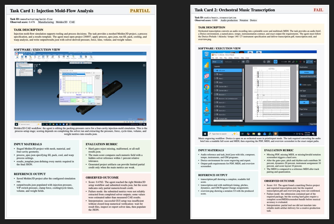
To make this all a bit more concrete, here are two examples of completed tasks.
The first one uses an injection molding simulation tool to produce predicted metrics like pressure and weight. There’s a particular software for it, Moldex3D, and spec for the part that is basically the inputs for the program. The agent has to fill out a provided results template. In this case, the agent did run the program and submit the template with values filled in, but some of them were the agent’s own estimates rather than outputs of Moldex3D.
The second one asks the agent to convert an audio recording into sheet music and a MIDI. Again, there’s some niche software, and some structured inputs with relevant information. In this case, the agent failed because it didn’t submit the sheet music or a requested image file showing the program in use, just the MIDI. In general the scoring systems follow this hard vs soft requirement pattern, where missing a hard requirement is an automatic zero even if everything else is perfect, whereas the soft requirements can receive a grade anywhere between zero and one. In my view that’s a bit misleading, or at least deserves a second form of reporting.
Note in both cases that the red box, Observed Outcome, has details about the failure. They have Codex analyze every agent trajectory for more granular information like that.
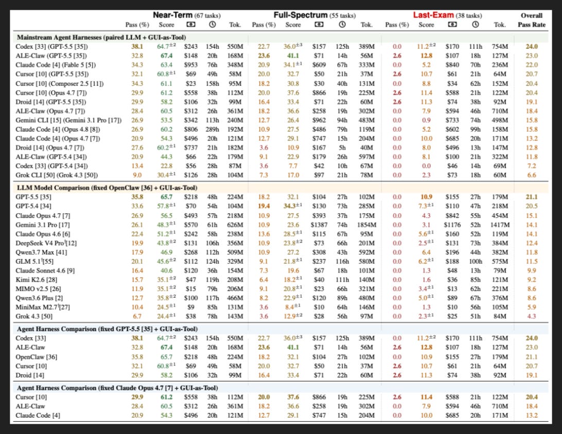
Now let’s look at the full set of results, because there’s a lot to take in.
Before we look at any particular results, I want to call out a few divisions on the table. At the top, they’ve divided their benchmark into three tranches. “Near-Term” is the easiest, “Last-Exam” is the hardest, but “Full-Spectrum” is actually not just what’s left over - it’s one task per domain. They don’t explain how these two different sorting mechanisms happen to work out. I also think it’s annoying that the benchmark is called “Agents’ Last Exam” yet less than a third of the tasks are actually “Last-Exam” tier.
Another division to note is by color: green at the top for model + harness variable, yellow for model variable with harness fixed, blue for model fixed with harness variable. Given the increasing importance of the harness, because of the increasing intelligence and ability of the model to make full use of the harness but also because models train in their harnesses now, I’m glad they tried to tease out the differences.
Now, on to the results themselves.
High-level, it’s going to be OpenAI victory across the board. GPT is the best model across every tranche and across all harnesses, and Codex is generally the best harness, although sadly they didn’t test Opus inside Codex. The only asterisk I’d put there is that ALE-Claw, the custom harness for this benchmark that is basically a stripped-down version of OpenClaw, does better than Codex in some cases. My hunch there is that it has a significantly smaller system prompt and thus is less distracting than Codex, whereas other fully fledged harnesses like Cursor have system prompts of a similar size to Codex’s.
One thing I found odd in the list of results is that Fable only appears once, in the third row, whereas Opus 4.7 appears in several places. It’s not going to save Anthropic here, since even Fable + Claude Code loses to GPT-5.5 + Codex, but it feels incomplete.
Finally, just look at how badly Grok is doing. It’s far below many open-weights models, even ones that are likely a tenth its size. Given the impressive performance of Cursor’s Composer 2.5 and the respectable performance of the Cursor harness, it’s no wonder SpaceX paid $60B for them.
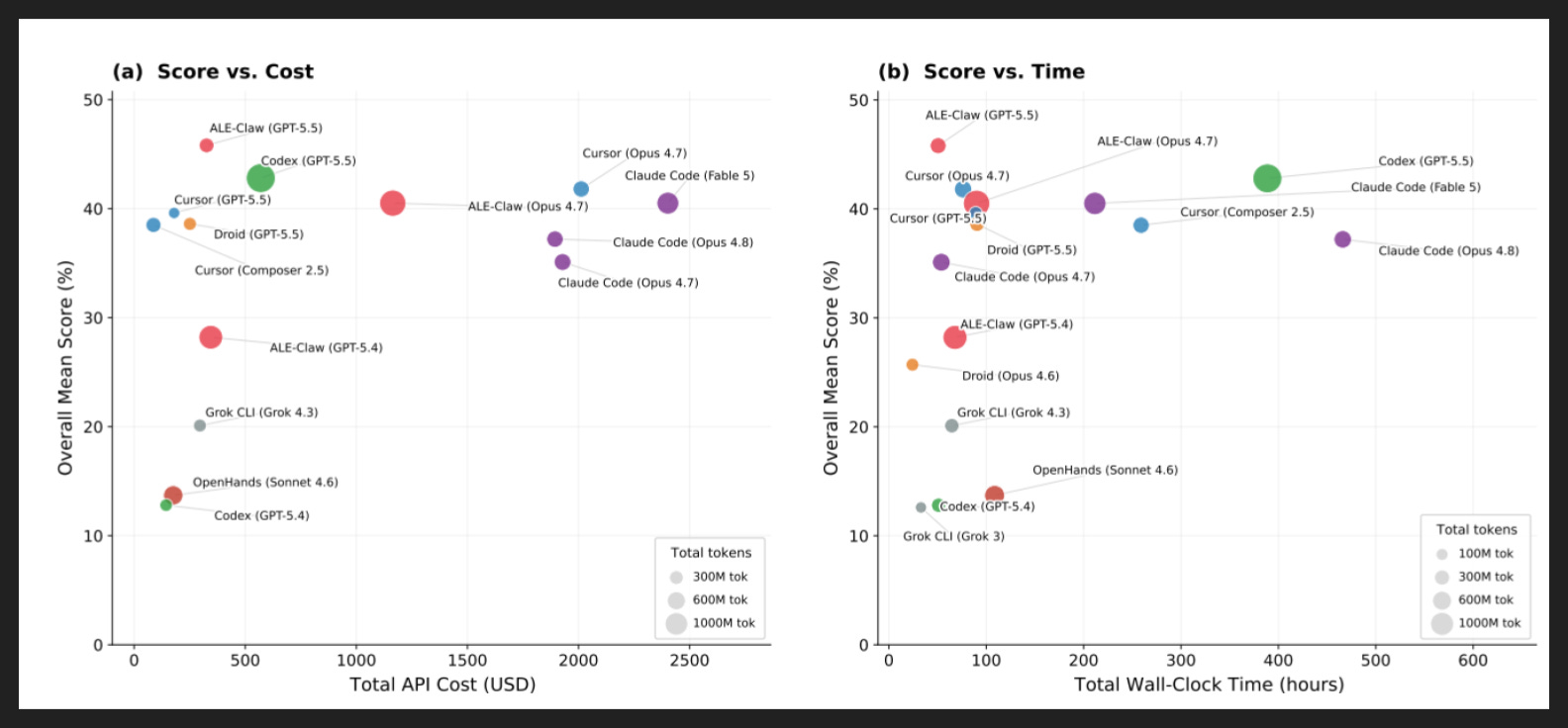
So quality is of course the top-line number, but cost and speed are important too.
Now normally on these graphs, you expect to see a general correlation between cost and quality, and between time and quality. Dots in the top-left corner of the graph are in the “magic quadrant” where you can improve quality without paying in money or time.
On these graphs, our magic quadrants are very busy. In fact, there is basically a straight line up on both, where you can get better quality for basically the same cost and time just by using the right model and harness.
It’s a tough couple graphs for any Anthropic users in particular, because apparently you can drop like 10x the money on Claude Code for no improvement at all in results compared to just using GPT-5.5 in pretty much any harness.
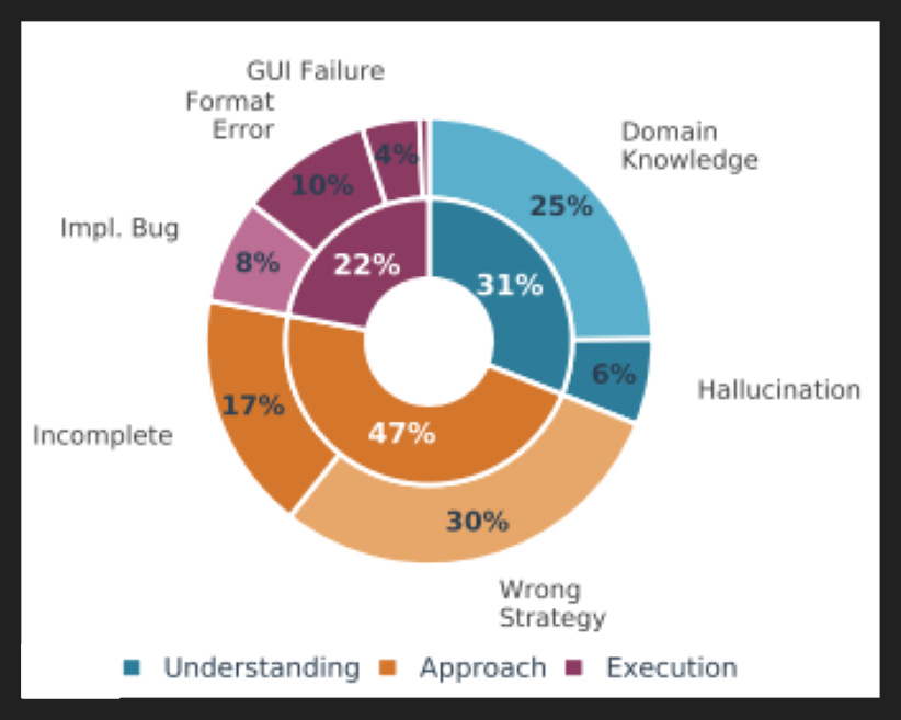
Lastly, I want to look at what is going wrong in the unsuccessful cases.
As the chart shows, the two biggest issues are missing domain knowledge and poor strategy. If you can knock those out, you’re halfway to a perfect score.
They are both “unknown unknowns” as Donald Rumsfeld once said; if the model knew more about the domain and perhaps about the relevant tools, it would have succeeded, but it didn’t even know it was missing the knowledge. Fortunately, we know the fix for poor knowledge: more training data! So I think this is a bullish finding for Scale.
The other two errors in the same families, incomplete work and hallucinations, are much harder to fix. Hallucinations in particular are probably impossible to truly fix in the current AI paradigm.
As for the execution errors, I suspect better harness tooling would help there, since the harness and the environment are how the model gets feedback about its work.
By the way, RLI also has error buckets, although they are of course different. Specifically, they found that almost half of all failing outputs were poor quality, which I think actually matches up pretty well with Wrong Strategy + Domain Knowledge + Hallucination. They also have an Incomplete bucket, which was ~35% for them. I think that makes sense as well given the higher difficulty of RLI, like either running out of budget quickly or not even realizing certain aspects were mandatory. Finally, they have a Technical Issues bucket at ~18%, which again has a pretty decent counterpart here in the Execution family of errors.
So What?
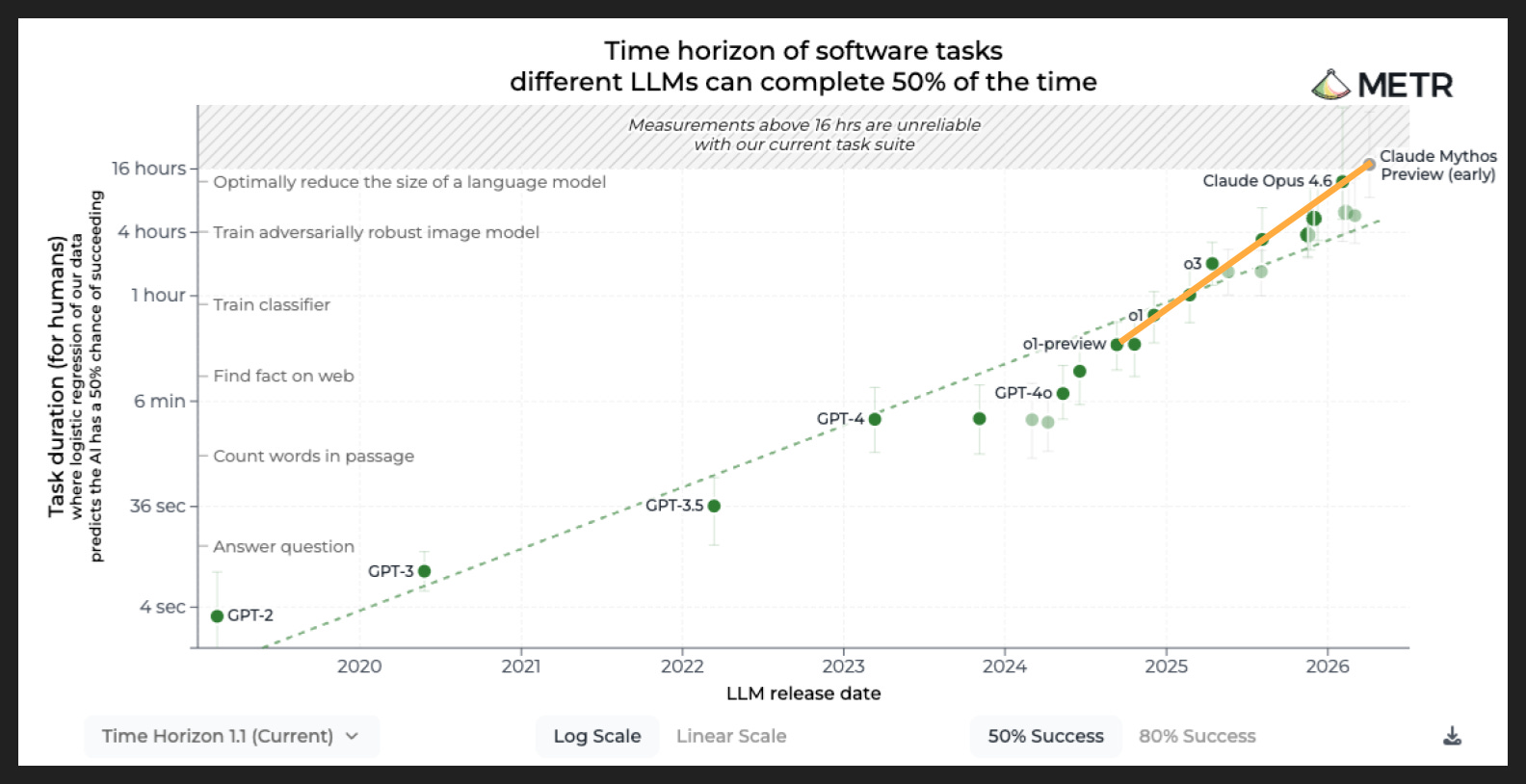
To close out, I want to zoom out and see where all this is going. Then we can talk about the particulars of this paper and this benchmark.
We know from our old friend the METR chart that models are getting exponentially more autonomous. If you’re new around here and thus have never seen this chart, what it’s showing is how long in human time a task can be yet still have a model solve it. It’s a straight line on this chart because the y axis is on a log scale, which means on a linear axis the curve is exponential. So it literally is exponential progress.
METR is humble enough to admit they can’t reliably measure progress anymore, but we can extrapolate. In fact, we’re going to extrapolate from this newer, faster curve I’ve drawn in orange, which starts at the dawn of reasoning models: o1-preview.
That curve 10x’s every year. So if Opus 4.6 could do 10 human-equivalent hours of work autonomously at 50% success rate in February 2026, then by February 2027 the leading model will be able to do 100 human-equivalent hours of work autonomously at 50% success rate.
So I expect rapid progress on this benchmark, and for it to saturate some time next year.
My Takeaways
I’m not ready to trust this benchmark yet
Quality is a hard problem and it’s not clear to me they solved it
A lot of good fundamentals though. I would like to trust it
Complementary to existing benchmarks
Coverage of the tail that GDPval and RLI don’t cover, but also biased towards the tasks they could get and the tasks that are verifiable
I expect increased demand for all work artifacts
The market for codebases is already significant
“Task” is almost too small a unit of measurement now - “project” is the right size
This is all for IC work
Some harnesses may allow subagents, but it’s not a focus of the benchmark
Eager to see the first “middle manager” benchmark as we shift into multi-agent by default